Web design is an amazing field. It is a field of work where creativity and technical knowledge meet and create beautiful things. Well, not always. But when they do, it can be astonishing. How does that work?
There are certain principles or lines of thought that can help beginners and professionals alike when trying to design a visually appealing web page. This article presents five of them, giving you a breakdown of how they work.
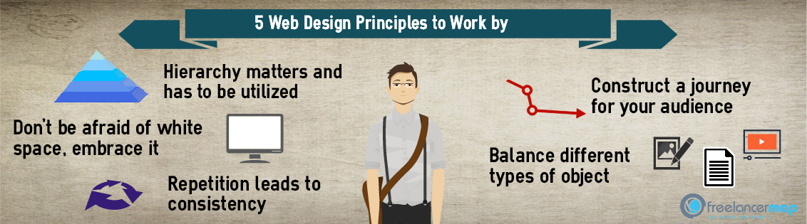
1. Hierarchy matters and has to be utilized
Firstly and most importantly, hierarchy is a big deal. Figure out what the most important things on your webpage are – those can be feedback boxes, social media buttons or an “add to cart” option. Whatever it is, make sure it’s prominent enough to get engaged with. Hierarchy can work in many different ways. It can be the position of the object, its size, its color or simply its font. Figure out what the important things are and highlight them!
2. Don’t be afraid of white space, embrace it
The empty space between objects has often been underrated in the past, but nowadays is the center of a motto a lot of designers swear by. White space might be naively seen as a waste – after all, it doesn’t offer any information, entertainment or engagement, right?
Wrong. Kind of wrong. It doesn’t do that, but it lets you highlight the things that do all those things and helps the audience differentiate between them. You can have the most interesting things in the world, but if they’re just chaotically standing next to each other without some white space to balance things out, they’ll end up being too tiring to the eye and kill the user experience.
3. Repetition leads to consistency
Another thing that might seem redundant is repeating stuff. Showing the same thing over and over again can be boring and sometimes doesn’t offer additional value. With design, repetition of certain elements can be key. It’s a different kind of repetition, though.
Think about color schemes, logos or strong, three to five word sentences. If you consistently use those, they become part of your brand and leave a strong imprint on anyone who recognizes them. Next time they see your name mentioned somewhere, they are far more likely to link it with those consistent items that stuck to them. That’s how your brand is rarely forgotten.
4. Balance different types of object
Newspapers and magazines have been working at this for a long time. In fact, some of the first newspapers used to contain only boxes of text, tightly packed next to each other. This was, of course, largely attributed to technology. Once pictures and images could be fitted in, printed products quickly turned towards searching for the right mix of pictures and text.
Wait, why am I telling you that story, this isn’t an article about newspapers, right? It isn’t, but this principle applies to web design and many other things. Whether we’re talking about a presentation or a webpage, clutters of text wear your audience down. I would argue that clutters of pictures do the same, as do videos and GIFs. This is why you should use all of those elements in moderation and provide a variety of visual experiences for the visitors of your webpage.
5. Construct a journey for your audience
Human brains have a funny way of functioning in specific patterns. In most of today’s world, people are largely used to read in certain directions – from left to right and from up to down. Imagine it as a “Z” shape. How does that help you in design? Well, once you know where the eye usually goes first, you can place your content in a specific order, highlighting the stuff you deem most important. A beginner mistake in web design is putting the most important things in the center of your webpage. Users intuitively look to the sections that are place to the right and on the upper part.
This isn’t something that should be done independently from our others tips, though. If the journey you created counters the hierarchy of your website or the way you used white space, it will lead to confusion.
Make sure to consider the full picture when looking at each principle listed here and don’t miss out our 5 essentials on becoming a successful freelance web designer!
—–
Pic: ©Unsplash